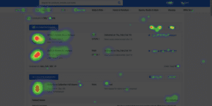
Imagine if you could see exactly where people are clicking, scrolling, or getting stuck on your website. That’s what heat mapping does! It’s like a visual report that shows how visitors interact with your site, so you can make changes that keep them engaged and turn more visitors into customers.
Types of Heat Maps & What They Tell You
🔥 Click Maps – Show where people are clicking the most (buttons, links, or even spots that look clickable but aren’t).
🖱️ Move Maps – Track where visitors move their mouse, giving clues about what grabs their attention.
📜 Scroll Maps – Show how far down the page people scroll, so you know if they’re seeing your most important content.
Why This Matters for Your Business
✅ Are people clicking your “Buy Now” button? If not, maybe it’s in the wrong spot.
✅ Are visitors leaving too soon? If they stop scrolling halfway, they might be missing something important.
✅ Are people clicking things that don’t do anything? That could mean your site layout is confusing.
How You Can Use Heat Mapping to Improve Your Website
🔹 Move important buttons where people naturally click.
🔹 Break up long sections of text to keep people scrolling.
🔹 Test different colors or wording for buttons to see what gets more clicks.
Using heat maps helps you understand what’s working and what’s not—so you can tweak your site and keep customers engaged.
Want to make your website work smarter? Let’s chat! 🚀


